

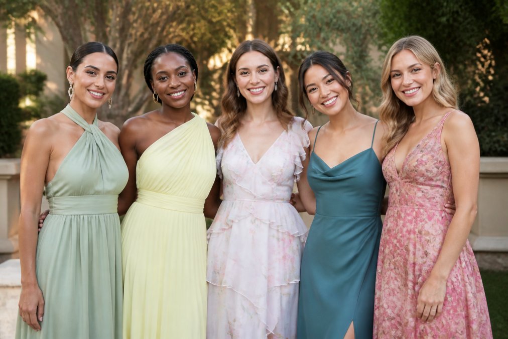
5 Best Colors to Wear to a Spring Wedding
Table of Contents
- 5 Best Colors to Wear to a Spring Wedding
- 1. Cobalt Blue: Bold Depth and Sophistication
- 2. Soft Sage Green: Fresh and Understated Elegance
- 3. Lavender: Romantic Without Being Predictable
- 4. Butter Yellow: The New Elegant Neutral
- 5. Persimmon and Tomato Red: Confident Energy
- Understanding Spring Wedding Guest Dress Code
- How to Style Statement Pieces for Spring Weddings
- Wedding Guest Outfit Ideas for Spring: Fabrics and Silhouettes
- Frequently Asked Questions
Last Updated: September 2, 2026
5 Best Colors to Wear to a Spring Wedding
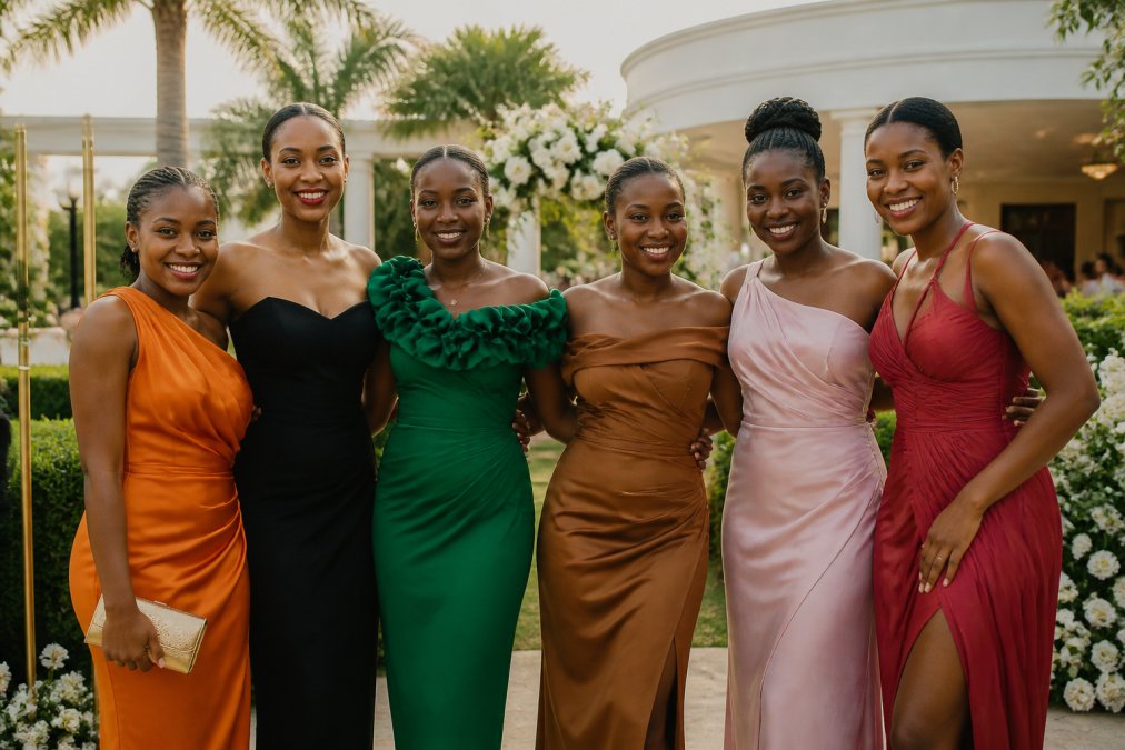
Formal wedding guest dress searches have surged 690% in the past three months, signaling a shift in how women approach spring wedding attire. According to LTK fashion data, searches for "bridal guest dress" jumped 396% during the same period. The 5 best colors to wear to a spring wedding aren't predictable pastels. Instead, this season is dominated by jewel tones, saturated brights, and sophisticated neutrals that photograph beautifully and flatter diverse skin tones.
At KAHINDO, we've observed women moving beyond safe, washed-out hues toward colors that command attention and feel celebratory. Below, we'll walk you through five standout colors that work across skin tones, lighting conditions, and wedding styles, plus styling strategies to make your choice feel effortless.
1. Cobalt Blue: Bold Depth and Sophistication
Cobalt blue is dominating spring 2026 wedding palettes, radiating depth and sophistication that photographs beautifully in both natural daylight and evening settings. True cobalt is a saturated, vibrant shade that brings energy without feeling costume-like. It works because it's bold enough to stand out, refined enough for any wedding formality.
Cobalt is versatile across skin tones. On warm skin, it creates striking contrast. On cool skin, it harmonizes naturally. In photographs, cobalt holds its depth even under harsh midday sun or soft golden-hour lighting.
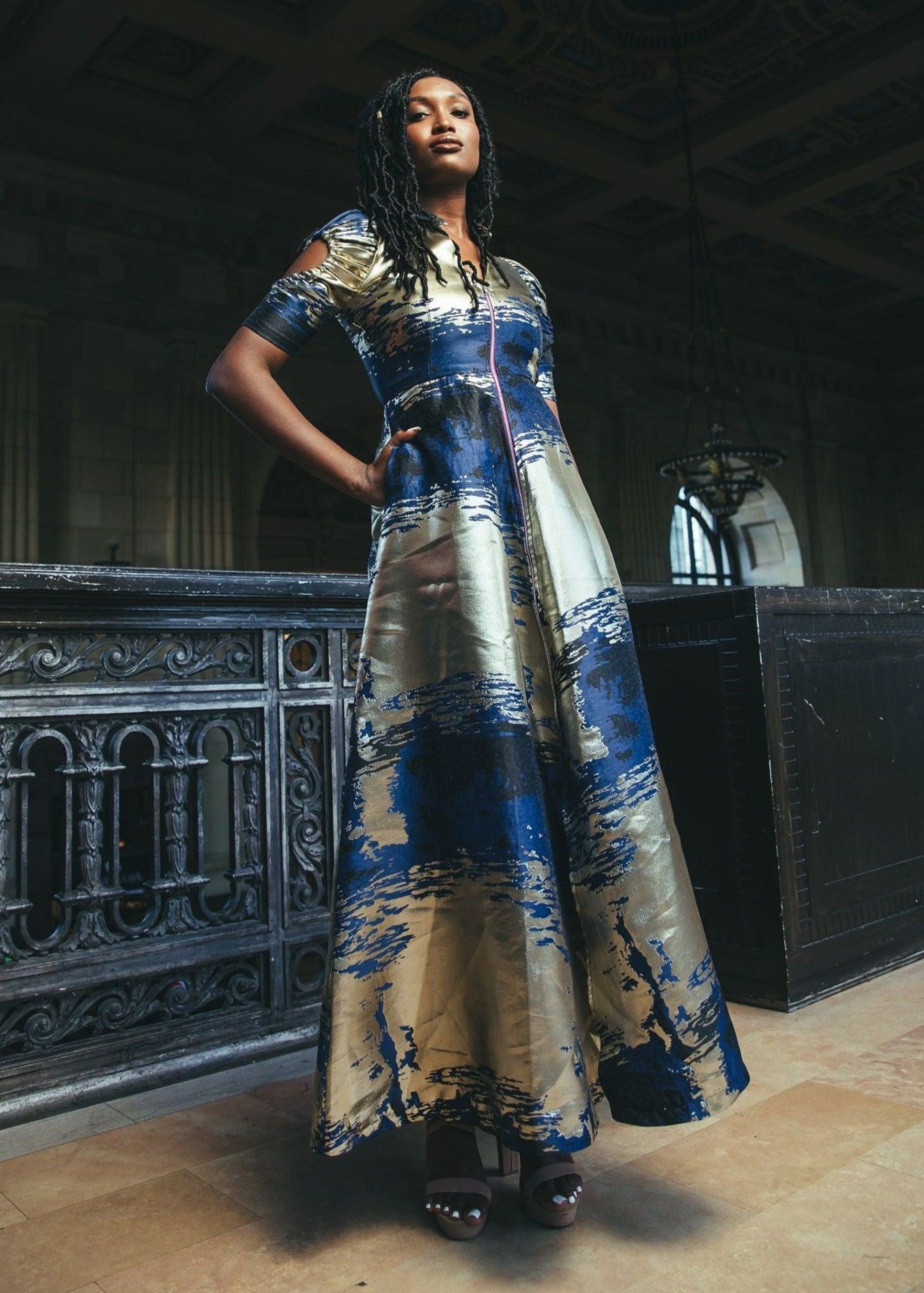
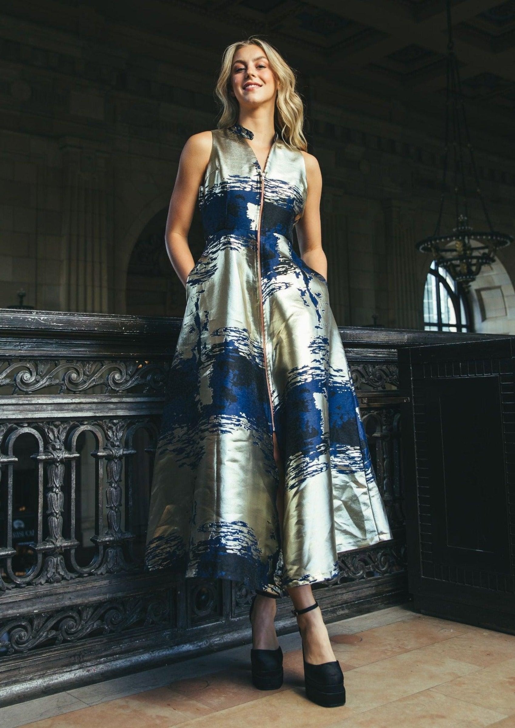
The key to wearing cobalt successfully is letting the color do the work. Pair it with minimal jewelry, a simple gold or silver bracelet, drop earrings if desired. For fabrics, silk or silk-blend materials amplify cobalt's richness. Lightweight organza, like [KAHINDO's Double Collar Ombré Organza Midi Dress](https://kahindo.com/products/double-collar-ombre-dress) in blue ombré ($345), offers movement and texture while maintaining the color's intensity.

Avoid pairing cobalt with warm metallics like rose gold. Stick with cool-toned metals, neutral leather accessories, and minimal pattern.
2. Soft Sage Green: Fresh and Understated Elegance
Soft sage green offers calm, understated elegance that feels fresh without being predictable. Modern sage is nature-inspired and versatile, making you look healthy and glowing without requiring a tan.
Sage works across all skin tones because it sits neutral on the color wheel. Fair skin reads it as sophisticated and airy. Medium skin tones see it as grounding and natural. Deep skin tones experience it as rich and jewel-like.
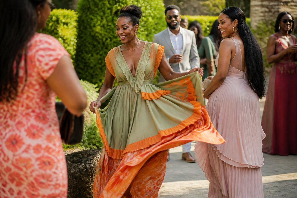
The challenge with sage is choosing the right depth. Pale, almost-gray sage can read as washed-out. Instead, opt for a sage with actual pigment that holds color under fluorescent lights and in photographs. [KAHINDO's Sage Green & Orange Cotton Maxi Dress with Ruffles](https://kahindo.com/products/kariba-dress) ($85) pairs sage with warm orange accents, creating a balanced, intentional look.
For styling, sage pairs beautifully with warm metallics: gold, brass, warm silver. Leather accessories in caramel, tan, or rust complement the earthy quality. Avoid cool silvers and icy whites.
3. Lavender: Romantic Without Being Predictable
Lavender feels fresh, romantic, and modern without being too bold, especially for spring and early summer weddings. What separates 2026 lavender from previous seasons is saturation and undertone. Pale, washed-out lavender can read as babyish or flat. Digital lavenders and periwinkles with more violet undertone feel contemporary and sophisticated.
According to wedding color trend analysis from The Abbey Rose, 2026 is "flipping the script beyond blush and eucalyptus," with moodier, more saturated palettes taking center stage. Lavender fits this shift perfectly.
The styling trick with lavender is understanding your undertone. If lavender pulls purple on you, lean into cool-toned metallics and silver or white gold jewelry. If it pulls blue on you, you can go either direction. Avoid warm oranges and rust tones, which can make lavender look muddy.
For fabric, lavender shines in lightweight, flowing materials like chiffon and silk-blend organza. Matte fabrics can make lavender feel flat, so prioritize lustrous finishes.
4. Butter Yellow: The New Elegant Neutral
Butter yellow has emerged as the sophisticated cousin to last year's trend colors, offering an elegant neutral that flatters various skin tones and works beautifully for daytime events. This is soft, creamy yellow, not neon, not mustard, not golden. It's the yellow of warm candlelight and afternoon sun through linen curtains.
Butter yellow functions as a neutral while still feeling intentional and modern. It's approachable enough for conservative dress codes, bold enough to feel fashion-forward. Fair skin reads it as luminous and warm. Medium skin tones experience it as grounding and natural. Deep skin tones see it as rich and luxurious.
The best butter yellows have a slight green undertone, just enough to feel natural and sophisticated rather than artificial. Styling butter yellow is straightforward: it pairs with virtually any metal, any neutral, any earth tone. Minimal jewelry works best. For fabrics, silk and lightweight organza maintain butter yellow's warmth and luminosity.
5. Persimmon and Tomato Red: Confident Energy
Persimmon and tomato red represent the boldest option on this list, and that's precisely why they're trending for 2026 spring weddings. These aren't the reds of holiday parties or formal black-tie galas. They're vibrant, energetic, and distinctly modern.
Persimmon strikes a balance between vibrant and refined. It's an orange-red that feels less aggressive than true red. Tomato red is deeper and more saturated, a confident, unexpected pop.
The key to wearing red or persimmon successfully is confidence and undertone matching. Warm skin tones should lean toward orange-based reds like persimmon. Cool skin tones can wear true red or blue-based reds. Red carries specific color symbolism in some cultures, so context matters. In Western wedding traditions, red is increasingly accepted for guests (though still not for the bride).
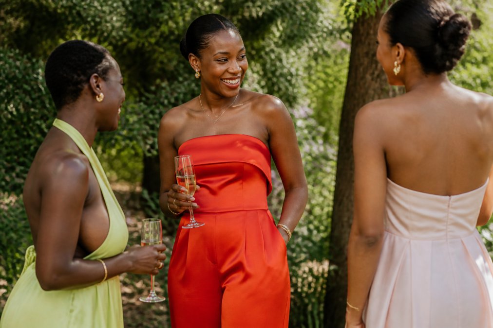
For styling, red and persimmon pair best with cool-toned metals: silver, white gold, platinum. Minimal jewelry keeps the focus on the color. For fabrics, satin and silk amplify the richness of these shades. [KAHINDO's Strapless Satin Wide-Leg Jumpsuit with Pockets](https://kahindo.com/products/silky-red-jumpsuit) ($145) in red-orange demonstrates how satin's luminous finish makes these bold colors feel sophisticated.

Understanding Spring Wedding Guest Dress Code
The term "spring wedding guest attire" encompasses several distinct dress codes, and color choice depends entirely on which one applies. Semi-formal and cocktail attire, the most common spring wedding codes, allow for the full spectrum of colors discussed here. Black-tie optional weddings still benefit from bold color choices, though darker, more saturated shades feel more appropriate than pastels.
A critical distinction: dress code governs formality level and silhouette, not color. Jewel tones, saturated brights, and sophisticated neutrals work across all spring wedding dress codes. What changes is fabric weight and silhouette formality. A cobalt blue silk gown reads formal; a cobalt blue cotton dress reads casual.
The one universal rule: avoid white, ivory, cream, and pale champagne unless the invitation explicitly states otherwise. These shades can read as bridal. Similarly, avoid black unless the invitation specifies black-tie or formal evening wear.
How to Style Statement Pieces for Spring Weddings
Statement pieces demand intentional styling. A cobalt blue dress isn't a statement piece, the color is the statement. Everything else should recede: minimal jewelry, neutral shoes, a simple clutch.
Pick ONE statement element and build around it. If your dress is the statement, keep accessories minimal and neutral. If you're wearing a neutral dress, your statement can be jewelry, shoes, or a bold wrap.
For spring weddings, fabric weight and texture matter. Lightweight materials, silk, linen blends, organza, cotton, feel appropriate for warm weather. Heavy satin or velvet reads as overdressed. [KAHINDO's Strapless Ombré Organza Mini Dress](https://kahindo.com/products/strapless-ombre-mini-dress) ($370) in blue ombré uses organza's ethereal quality to create movement without requiring additional accessories.

The shoe choice is critical. Metallic heels (gold or silver) work with virtually any color. Neutral leather, caramel, tan, nude, black, grounds bold colors. Avoid shoes that compete with your dress color unless deliberately creating a monochromatic look.
For jewelry, the rule is restraint. One statement piece (bold earrings OR a striking bracelet OR a cocktail ring) or several delicate pieces, never both. Bold color dresses benefit from minimal jewelry.
A wrap or jacket is essential for spring weddings held in air-conditioned venues or for evening receptions. Neutral linen, silk, or cotton wraps complement bold colors. Match the wrap's undertone to your jewelry metals.
Wedding Guest Outfit Ideas for Spring: Fabrics and Silhouettes
Fabric choice determines how a color reads and how comfortable you'll feel throughout the day. Spring temperatures range from cool (50s) to warm (70s+), and humidity varies dramatically by region and time of day.
Lightweight silks and silk blends are ideal for spring. Silk charmeuse drapes beautifully and holds color richly. Silk organza creates ethereal movement while maintaining structure.
Linen and linen blends work for casual and semi-formal daytime weddings. Linen blends maintain structure while offering breathability.
Cotton and cotton blends suit garden parties and outdoor ceremonies. High-quality cotton drapes well and feels comfortable in warm weather. KAHINDO's Sage Green & Orange Cotton Maxi Dress with Ruffles ($85) demonstrates how structured cotton can feel elegant.
Avoid heavy fabrics like velvet, thick brocade, or dense satin for daytime spring weddings. These read as overdressed and feel uncomfortable in warm weather.
For silhouettes, spring weddings favor movement and flow. A-line dresses, midi lengths, and flowing maxi silhouettes work across all body types and dress codes. Architectural details like ruffles, pleating, and asymmetrical hems add visual interest to solid colors. Avoid overly embellished pieces that compete with bold colors.
| Color | Best Fabric | Ideal Silhouette | Shoe Style | Jewelry Approach |
|---|---|---|---|---|
| Cobalt Blue | Silk organza, silk charmeuse | A-line midi, flowing maxi | Silver or neutral heels | Minimal, let color lead |
| Soft Sage Green | Linen blend, cotton | Flowing maxi, A-line midi | Gold or caramel heels | Gold jewelry, warm metals |
| Lavender | Silk, chiffon | A-line midi, asymmetrical hem | Silver or cool metals | Cool-toned jewelry |
| Butter Yellow | Silk, linen blend | A-line midi, structured A-line | Any metal, neutral leather | Minimal jewelry |
| Persimmon/Tomato Red | Satin, silk charmeuse | Fitted midi, wide-leg jumpsuit | Silver or cool metals | Minimal, color is statement |
The global wedding wear market is projected to grow from $82.4 billion in 2024 to $109.9 billion by 2030, reflecting increased investment in occasion-ready pieces (grandviewresearch.com). This growth signals that guests are prioritizing quality, intentionality, and personal style in their wedding wardrobe choices, moving beyond generic "safe" colors toward shades that feel authentic and photograph beautifully.
The five colors outlined here represent the current consensus among fashion editors, wedding stylists, and color experts. They work because they're rooted in color psychology, skin tone compatibility, and photography principles. When you choose a color from this list, you're choosing a shade that's been tested across lighting conditions, diverse skin tones, and real wedding scenarios.
The most important principle: wear the color that makes you feel confident. If butter yellow feels joyful and authentic to you, wear it even if cobalt blue is technically more flattering. Confidence reads in photographs. Authenticity translates across the room.
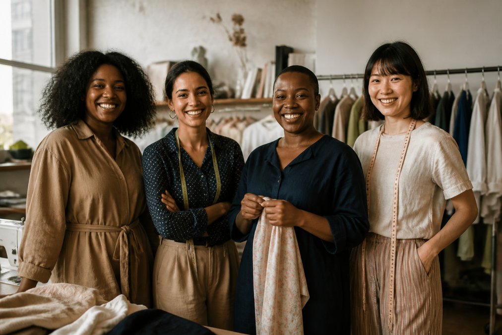
At KAHINDO, we believe wedding guest dressing should feel effortless and intentional, a reflection of your personal style. Our collection of handcrafted wedding guest dresses in bold jewel tones, saturated brights, and sophisticated neutrals is designed for guests who want to feel confident and distinctive. Every piece is made by female artisans in Kenya using fair-trade practices, so your choice supports women's economic empowerment while you celebrate. Explore our blue ombré pieces, sage green options, and bold red-orange silhouettes. Shop KAHINDO and wear a color that feels authentically you.
Frequently Asked Questions
Q: What are the best spring wedding colors for 2026?
A: The top spring wedding colors for 2026 include cobalt blue, soft sage green, lavender, butter yellow, and persimmon. Cobalt radiates depth and sophistication in photos, while sage green offers understated elegance perfect for garden celebrations. Butter yellow works as a sophisticated neutral that flatters multiple skin tones, and persimmon brings confident energy without the intensity of pure red.
Q: How do I choose the right spring wedding guest color based on dress code?
A: Match your color choice to the formality level. For black-tie or formal evening weddings, jewel tones like cobalt, lavender, and deep burgundy work best. For semi-formal daytime or garden celebrations, softer options like sage green, butter yellow, and blush pink are appropriate. Check the invitation for dress code specifics, and remember that black and navy remain universally acceptable for any wedding formality. When in doubt, jewel tones bridge both day and evening events elegantly.
Q: Can I wear floral prints or pastels to a spring wedding?
A: Yes, but with care. Floral prints are perfect for spring weddings, especially garden or daytime celebrations. However, avoid ultra-pale pastels like washed-out blush or misty ice blue, which can read as white or ivory in bright sunlight and risk competing with the bride. Instead, choose saturated pastels or jewel-tone versions of spring colors. Soft sage green, periwinkle, and dusty rose photograph beautifully without the risk of appearing bridal.
Q: What colors should I avoid wearing to a spring wedding?
A: Avoid white, ivory, cream, and any pale shade that could be mistaken for bridal wear in certain lighting. Steer clear of ultra-pale yellows, which read as ivory, and very pale gray, which often appears white in photos. While red can work, extremely bright or dominant reds may feel overpowering. Black is always acceptable, but some traditions reserve it for evening events. When choosing pastels, ensure they're saturated enough to read as a distinct color rather than a washed-out white.
Q: How do I know if a color will photograph well at a spring wedding?
A: Colors photograph differently depending on lighting. Jewel tones like cobalt, emerald, and sapphire look richer and more dimensional in photos than pastels. Saturated colors with depth, such as butter yellow, persimmon, and sage green, maintain their vibrancy in natural sunlight and artificial lighting. Avoid very pale or washed-out shades, which can appear flat or blown out in bright daylight. Test your chosen color in similar outdoor or indoor lighting conditions before the event to see how it translates.
This article was written using GrandRanker