


Article: Best Colors for Mother of Bride Dresses

Best Colors for Mother of Bride Dresses
The right color does more than flatter. It sets the tone for how you feel when every eye turns your way, from the ceremony entrance to the last dance. If you are choosing the best colors for mother of bride style, the goal is not to disappear into the background or compete with the bridal party. It is to look polished, memorable, and completely yourself.
That balance matters. A mother of the bride look should feel elevated enough for the significance of the day, but personal enough that it never reads as costume. Color is where that distinction begins.
How to choose the best colors for mother of bride looks
The strongest choice usually sits at the intersection of three things: the wedding palette, your own coloring, and the mood of the event. Ignore any one of them, and the dress can feel slightly off. Honor all three, and the look feels effortless.
Wedding colors should guide you, not trap you. If the bridal party is in sage, dusty blue, or terracotta, you do not need to match exactly. In fact, matching too closely can flatten the visual story in photos. A complementary tone often looks richer and more intentional. Think soft gold with sage, slate blue with dusty rose, or deep plum with a neutral fall palette.
Your own undertones matter just as much. A color that looks striking on the hanger can feel dull against the skin if the temperature is wrong. Warm undertones often come alive in bronze, champagne, olive, coral, and warm reds. Cooler undertones tend to shine in sapphire, silver-gray, lavender, navy, and berry tones. Neutral undertones have the most flexibility, which opens the door to both softened neutrals and saturated jewel colors.
Then there is the setting. A black-tie ballroom wedding can hold stronger contrast, richer fabrics, and deeper shades. A garden ceremony in late spring usually asks for a lighter hand. The best color choice does not just suit you. It suits the room.
The most flattering color families
Some shades return season after season because they offer elegance without feeling predictable. That does not mean safe. It means enduring.
Soft neutrals
Champagne, taupe, dove gray, mushroom, and soft mocha have long been among the best colors for mother of bride dressing because they photograph beautifully and feel refined in nearly any venue. They carry quiet luxury when the fabric has dimension, whether that is jacquard, satin, crepe, or artful draping.
The trade-off is that pale neutrals need intention. Too close to ivory, and they can read bridal. Too flat, and they may look washed out under bright daylight or flash photography. The answer is depth. Choose a neutral with warmth, texture, or sheen rather than anything chalky or stark.
Blues that do the work of a neutral
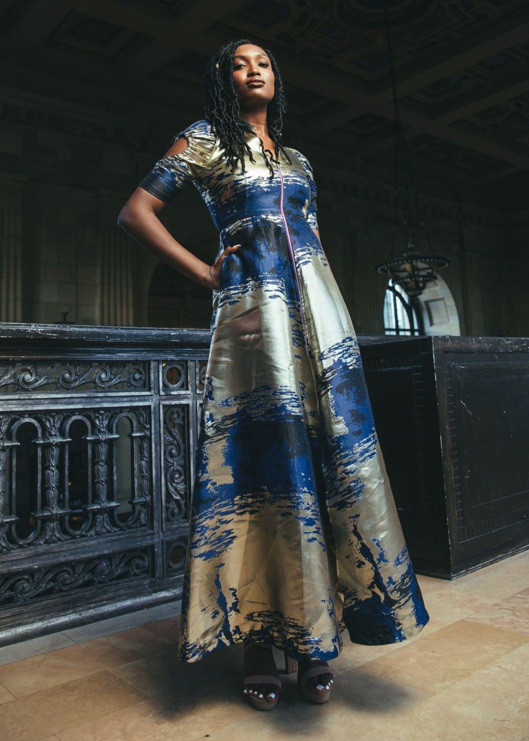
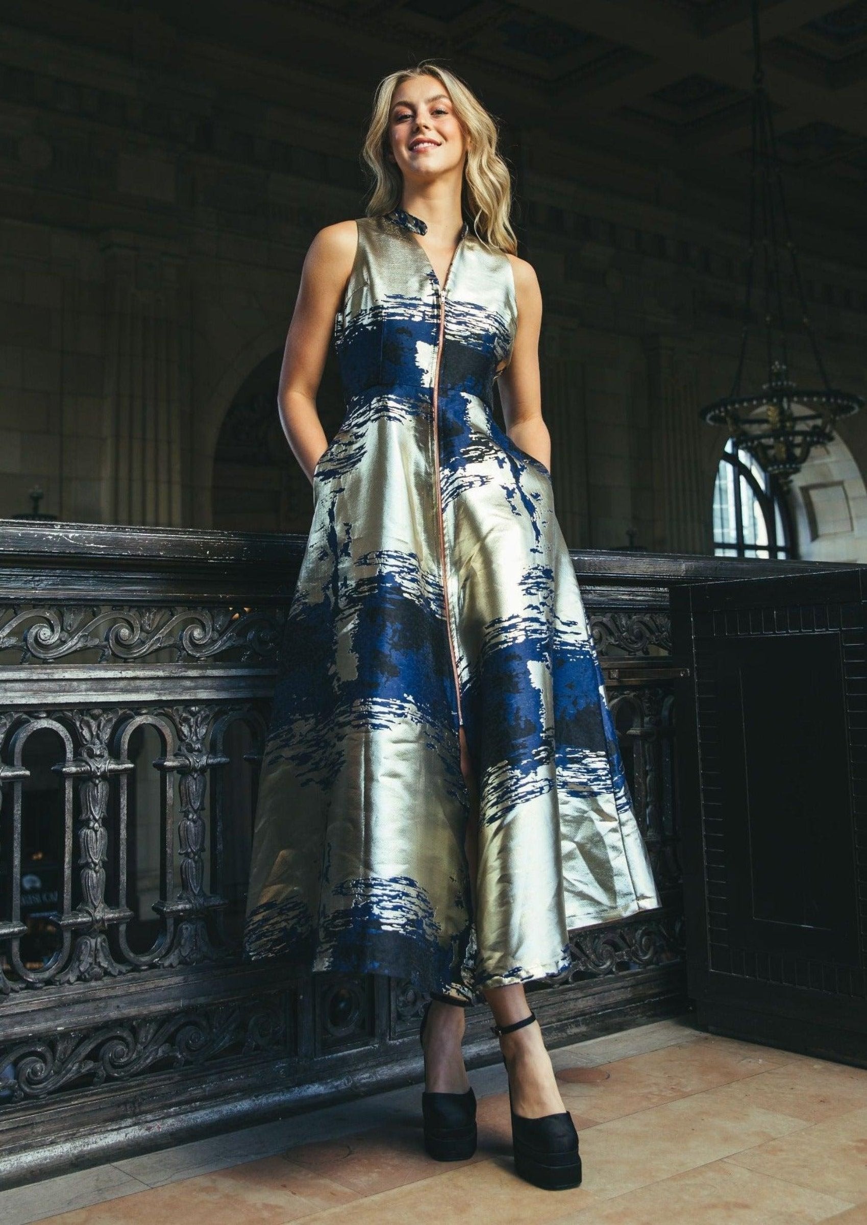
Blue is one of fashion's most useful formalwear colors because it can feel grounded, graceful, and confident all at once. Navy is a classic for a reason, but it is hardly the only option worth considering. Slate, steel blue, dusty blue, midnight, and soft teal often feel fresher while keeping the same sophistication.
If the wedding palette leans romantic or pastel, a muted blue creates harmony without looking overly coordinated. If the event is evening or black tie, a darker blue can carry the same authority as black while appearing softer and more celebratory.
Jewel tones
When a mother of the bride wants presence, jewel tones deliver. Emerald, amethyst, sapphire, garnet, and deep teal feel luxurious because they hold color with confidence. They also tend to flatter a wide range of skin tones, especially in fluid fabrics or structured silhouettes with clean lines.
This is often the right direction for fall and winter weddings, but not only those seasons. A summer evening celebration can absolutely support a bold jewel tone if the silhouette remains light and modern. The key is proportion. Let the color make the statement and keep embellishment selective.
Romantic pinks and mauves
Blush has long been part of the wedding conversation, but the more interesting choices often sit one step deeper. Rosewood, dusty mauve, antique pink, and muted berry offer softness with substance. They feel feminine without drifting into sweetness.
These shades work especially well when the wedding palette includes neutrals, greens, or mixed florals. They bring warmth to the face and can feel striking in sunset light. The caution is fit and fabrication. A weaker silhouette can make pink feel less polished than intended. Structure keeps it elegant.
Green with depth
Green is often overlooked, which is exactly why it can feel so modern. Olive, eucalyptus, forest, and deep moss can be extraordinary on mothers of the bride who want something directional yet timeless. Green also complements outdoor settings beautifully and sits naturally beside floral palettes.
There is nuance here. Bright kelly green or neon-leaning shades can feel too assertive for the role unless the wedding itself has a bold, fashion-forward dress code. Deeper and more complex greens tend to have more longevity.
Colors to approach with care
White, ivory, and anything that reads bridal are obvious no-go territory unless the couple specifically requests it. Black is more situational. In many cities and formal settings, black is fully accepted for mothers of the bride, especially in elegant evening silhouettes. In other families, it can still feel too severe or symbolic for a wedding.
Bright red also depends. In the right setting, a rich wine or garnet can look powerful and celebratory. A high-gloss fire-engine red may pull too much focus. That does not make it wrong. It means context matters.
Metallics deserve the same measured approach. Soft gold, pewter, bronze, and muted silver can be beautiful. Overly reflective finishes can dominate photographs. A refined shimmer usually works better than full shine.
Matching the color to the season and setting
Spring invites softness, but not fragility. Dusty blue, sage-adjacent green, mauve, and warm taupe all feel right at home. Summer can support both airy neutrals and vivid saturated tones, especially for evening weddings. Think soft coral, oceanic blue, orchid, or a rich teal with movement.
Fall is where deeper tones come into their own. Bronze, plum, forest, aubergine, and mocha all carry warmth without heaviness. Winter welcomes drama - midnight blue, emerald, garnet, pewter, and sophisticated black in families that embrace it.
Venue changes the equation. At a beach wedding, overly dark shades can feel visually heavy in full sun, while soft metallics and sea-toned blues feel effortless. In a historic ballroom, rich color and tailored structure often look strongest. Garden weddings tend to favor softened tones, though a bold print or saturated solid can be stunning when it feels intentional.
Should you match the wedding palette?
Not exactly. Belonging is better than matching.
A mother of the bride dress should live in conversation with the wedding colors, not mirror them. If the bridesmaids are in dusty lavender, you might choose slate blue, soft silver, or a deeper berry. If the palette is terracotta and sand, olive, bronze, or warm plum can feel connected without duplication.
This is where personal style should stay in the room. A landmark moment deserves more than compliance. It deserves discernment.
Print, texture, and statement color
Solid colors are not the only answer. For women drawn to fashion with more identity, a print can be every bit as formal as a solid, provided the scale and palette are controlled. A refined floral, abstract motif, or artful pattern in elevated tones can feel exceptional at a wedding, especially when the silhouette is clean.
Texture matters too. Brocade, jacquard, satin, and sculptural crepe can deepen a color and give it more presence. That is often the difference between a dress that simply fits the dress code and one that feels unforgettable. At KAHINDO, that point of view lives at the center of occasionwear - bold elegance, crafted with purpose, designed to be seen.
The color test that matters most
Once you have narrowed the field, stand in front of natural light and ask a sharper question than, Does this look nice? Ask, Does this color give me clarity? The best choice makes your skin look alive, your posture change, and the occasion feel equal to the dress.
That reaction is hard to fake. When the color is right, you stop adjusting and start arriving.
A mother of the bride dress should honor the day, but it should honor the woman wearing it too. Choose the shade that lets you do both with confidence.
